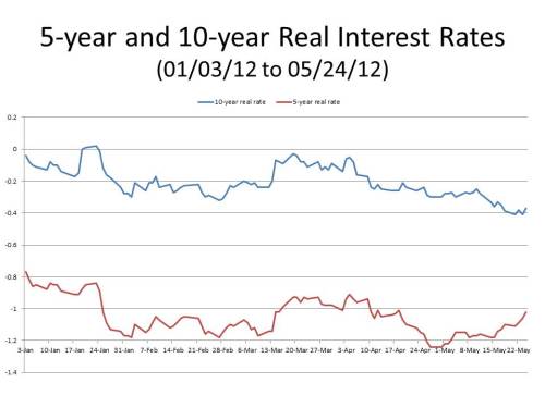
In a post last week, I pointed out that there was a highly unusual inverse correlation between the 5- and 10-year real interest rates as approximately reflected in constant maturity 5- and 10-year TIPS. (On the meaning of the term “constant maturity” see the very valuable and informative post in J.P. Koning’s excellent blog summarizing discussions in the many blogs that he follows and comments on) about the various blogs Since early May the correlation coefficient between the yields on constant maturity 5- and 10-year TIPS was about -.72 (as of today it’s -.77), while the correlation coefficient between the two yields since the start of 2012 was .86. It occurred to me after writing the post (I added an update to make the point) that one reason for the inverse correlation might be an increased in the expected likelihood of a financial crisis, in which case real short-term interest rates would rise during the crisis as people expecting to be short of cash bid up real rates trying to get their hands on cash ahead of the crisis, while also selling off assets (either fixed capital or inventories).
This week, I was able to do a little further work, looking at data since 2003, on the correlation between interest rates at the 5- and 10-year time horizons. Since 2003, the correlation between real 5- and 10-year interest rates is about .96. I computed monthly correlations, which are usually over .8 and regularly over .9. Only very rarely was there a (barely) negative monthly correlation, certainly nothing close to the -.77 correlation during the first 30 days of this month. However, as I computed the correlations, I found that a more meaningful measure of the relationship between the 5- and 10-year yields on TIPS is the absolute difference between them. The graph below plots the yields on 5- and 10-year constant maturity TIPS since 2003. The most striking period is clearly in October and November of 2008, when the yield on 5-year TIPS soared above the yield on 10-year TIPS, because of the desperate scramble for liquidity at the height of the financial crisis. A few other periods of financial stress, associated I think with the first signs of the bursting of the housing bubble, were also associated with yields on the 5-year TIPS slightly exceeding the yield on the 10-year TIPS.
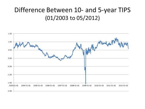
 A second graph displaying the difference between the yields on the 10-year and the 5-year TIPS is also useful, clearly showing the effect of the spike in short-term real interest rates at the height of the financial crisis.
In this context what is striking about the recent anomaly in the real term structure of interest rates is the steepness with which the difference between the yields on the 10- and the 5-year TIPS has been falling. The drop seems steeper than any but the one that started around October 6, 2008, three weeks after the failure of Lehman Brothers, but the day on which the Fed announced that it would begin paying interest on reserves. By the end of October, the difference between the yields on the 10-year and 5-year TIPS had fallen by over a percentage point. Since May 3, the difference between the yields on the 10-year and 5-year TIPS have fallen 37 basis points, so we are clearly not in a panic. But the signs are disturbing.


