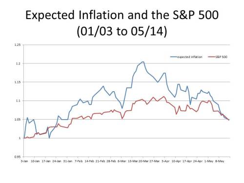
On Monday I wrote a post with the chart below showing the close correlation since January of this year between the S&P 500 and expected inflation as (approximately) reflected in the spread between the constant maturity 10-year Treasury note and the constant maturity 10-year TIPS. A number of other bloggers noticed the post and the chart. One of those was Matthew Yglesias who coupled my chart with a somewhat similar one posted by Marcus Nunes on his blog on the same day as mine.
One commenter (“Fact Checker”) on Matthew’s blog criticized my chart accusing me of cherry picking.
The second graph is meaningless, as it does not work through time.
Here it is from 1990: http://research.stlouisfed.org/fredgraph.png?g=7gX
Again from 2000: http://research.stlouisfed.org/fredgraph.png?g=7gY
From 2005: http://research.stlouisfed.org/fredgraph.png?g=7gZ
From 2009: http://research.stlouisfed.org/fredgraph.png?g=7h0
And in another comment:
The S&P + inflation chart is reproduced below, with longer windows. And as you suggest there is no correlation in any time frame but the very short window cherry picked by MY.
Two points to make about his comment. First, if Fact Checker had read Yglesias’s post carefully, or, better yet, actually read my post (let alone the original paper on which the post was based), he would have realized that my whole point is that the close correlation between expected inflation and stock prices is generally not observed, and that one would expect to observe the correlation only when deflation exceeds the real rate of interest (as it does now when slightly positive expected inflation exceeds the negative real real rate of interest). So the fact that the correlation doesn’t work through time was precisely the point of my post. Second, the graphs to which Fact Checker links use survey data by the University of Michigan of the inflation expectations of households. I do not totally discount such data, but I regard survey estimates of expected inflation as much less reliable than the implicit market expectations of inflation reflected in the TIPS spread.
To show that the correlation I have found is reflected in the data since approximately the beginning of the downturn at the very end of 2007, but not before, here is a graph similar to the one I posted on Monday covering the entire period since 2003 for which I have data on the 10-year TIPS spread.
 Before the beginning of 2008, there is plainly no correlation at all between inflation expectations and stock prices. It is only at some point early in 2008 that the correlation begins to be observed, and it has persisted ever since. We will know that we are out of this Little Depression when the correlation vanishes.

TIPS in the financial crisis were hit with liquidity problems that distorted prices.
Might be better to use the monthly Cleveland indices of expected inflation and compare that to monthly S&P500. I believe they go back to the 80s. Quarterly SPF inflation expectations go back even farther, if I’m not mistaken.
LikeLike
John, You are right. The fit of my regressions is actually not so great during the height of the crisis itself, and I think the reason is because the distortions produced by the liquidity issues that you refer to. I wouldn’t replace the daily data, which are available only using TIPS spreads, but they should be supplemented with the monthly data using the Cleveland Fed estimates as you suggest. But one loses a lot of data points by going from daily to monthly observations.
LikeLike
I wonder how much longer this is going to take. This “little depression” has already caused enough damage to the average american. The sooner the better. I can’t stand unemployment as high as it is.
LikeLike